Mental Model and User Experience in Digital Product Design
A simple take on how mental models shape user experience—from shopping habits to smartphone icons, and why breaking expectations can lead to user frustration.

So here’s a thing. Ever noticed how when we go to Indomart or Alfamart (yes, local pride 😄), the store layout always feels... familiar? You kinda know where things are, how to move around. That’s not magic it’s mental model at work.
This time, I wanna talk about how mental models and UX design go hand in hand. In UX, understanding how users think is basic stuff like the foundation to creating an experience that makes sense and feels smooth. And one of the core concepts to achieve that is... you guessed it mental model.

Example of a mental model flow
As I wrote in my previous post, mental model is about user expectations, shaped by habit. For example, when users open an e-commerce app, they already have a mental picture of how things should be like where the navigation bar is, how to find the cart, where the filters are, etc. If it feels too different from what they’re used to... they’ll feel confused or even frustrated.
Like Don Norman said in The Design of Everyday Things, mental models help people understand and predict how a system or object behaves. A good design reduces cognitive load, meaning users don’t need to think too hard just to do simple stuff.
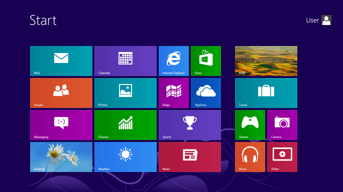
Let’s take a throwback example: in 2014, Microsoft released Windows 8 with that full-screen, boxy layout called "Metro UI". No Start Menu. Big tiles. Whole new vibe. But guess what? Users hated it. Why? Because it broke their mental model of how Windows was supposed to work. It was too much, too fast. Eventually, Microsoft brought back the Start Menu in later updates. Lesson learned.
An example of an information hierarchy (red box) that I think is easy and to the point, making it easier for users to use.
On the other hand, take Apple’s iPhone design. The icons are intuitive. Email app has an envelope icon. Phone app has... well, a phone. Even when they switched from skeuomorphic to flat design, users didn’t struggle much. Why? Because the change was gradual, and the mental model stayed intact.
So yeah, that’s a quick peek into how mental model connects with user experience. Maybe next time I’ll talk more about why this is so important when we design digital products.
2026 ©
All rights reserved. Crafted by Mochamad Rizana Mauluddin.