Mental Model First, Then Comes Information Architecture
How mental models shape user expectations—and how good information architecture turns those expectations into intuitive, easy-to-use digital products.

Let’s talk about how things connect mental model, UX, and information architecture (IA). What do they actually give us? What kind of output do they produce for users in a digital product?
Well, from what I’ve learned, the answer is: a structure. A way of organizing information that feels familiar for the user. That’s where information architecture comes in. Basically, it’s how product designers present and organize content so that it makes sense to users, based on what they already expect or understand.
So yeah, there are three things working together here: mental model, UX, and information architecture. They help guide how we design digital products that actually make sense to humans.
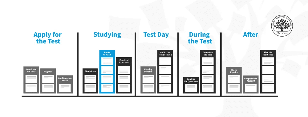
Example of a mental model flow
Don Norman, in The Design of Everyday Things, said that “good design is invisible.” And honestly, I love that line. To me, it means a good product just works. You don’t have to think too hard about what to click or where to go. Everything flows. You just... use it.
Then there’s BJ Fogg’s Behavior Model. It helps designers see what truly influences user behavior. If we want to create experiences that match the user’s mental model, we need to think about:
What motivates them,
What they’re capable of doing,
And what kind of trigger can nudge them to act.
Above I added an expert, BJ Fogg. Who is he, why is he only being discussed now? Perhaps you can check his LinkedIn, or if you want to see BJ Fogg's formula in Indonesian, you can visit Design Thinker Academy with the book title "Not Your Average UI/UX Designer." Design Thinker also has a workshop class that delves deeper into this topic and its practical application.
Now let’s go deeper into IA. Louis Rosenfeld and Peter Morville, in their book Information Architecture for the World Wide Web, said that IA is “the art and science of organizing information so it’s easy to find and understand.”
To put it simply: IA is the bridge between how users expect info to be organized, and how the digital interface actually delivers that info. It helps users find things faster and with less effort. The easier they find what they need, the better the IA.
One good example? LinkedIn.
Whether you realize it or not, LinkedIn’s IA is pretty smart. It makes it easy to find different content categories like Jobs, Networking, or Learning. It’s all organized to support users’ professional goals. Looking for a job? Just go to “Jobs.” Want more connections? Tap “My Network.” No need to guess.
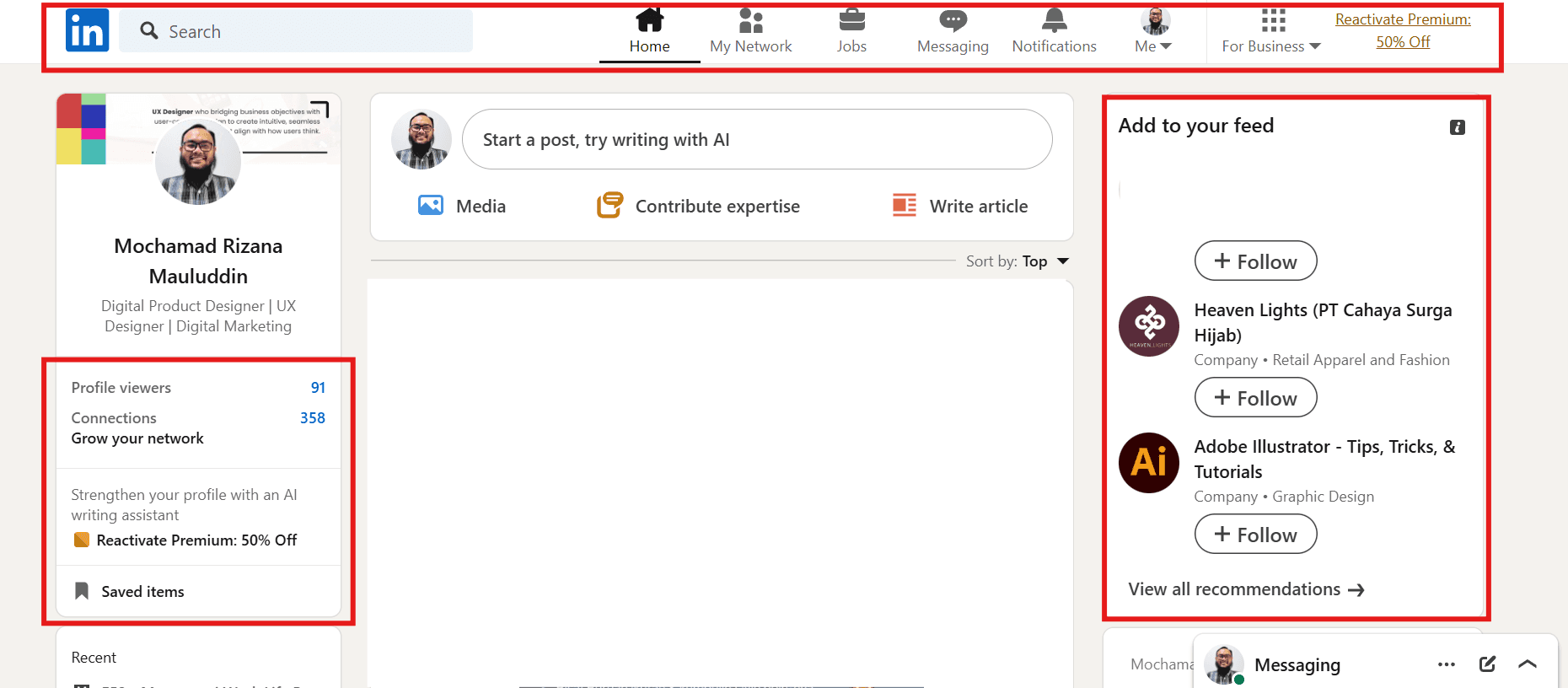
An example of an information hierarchy (red box) that I think is easy and to the point, making it easier for users to use.
So, to wrap it up:
Information Architecture is the foundation of a digital product that feels efficient and easy to use. A well-designed IA respects how users think (their mental model), organizes content logically, and makes important info accessible quickly. When all of these align, the user experience becomes smoother, more productive, and most importantly enjoyable. People actually want to use your product again. And that’s the goal, right?
2026 ©
All rights reserved. Crafted by Mochamad Rizana Mauluddin.