
FishLog Design System Foundation
FishLog's first design system: −50% UI inconsistencies across [3] products.
Role
UI Audit, Design System Foundation, Component Review, Visual Standardization
Industries
Fisheries, B2B Platform, Internal Product
Duration
Q3 2022 - Q1 2023
Executive Summary
Problem: Each FishLog product had drifted into its own visual style, so designers and developers kept rebuilding the same UI elements.
What I did: I [led] the UI audit across [3] products and defined the first style guide: color, typography, spacing, buttons, and component states.
Key decision: Ship a small, practical foundation first instead of a complete design system, because it had to be built alongside ongoing product work.
Result: UI inconsistencies across products dropped by 50%, and developers got one shared reference instead of recreating components.
Problems & Hypothesis
FishLog's product ecosystem had grown to include warehouse management, finance tools, and a B2B marketplace. Each product developed its own UI patterns, so the screens felt disconnected and the same components were rebuilt again and again.
UI components were not consistently used across products.
Designers and developers often recreated similar UI elements.
There was no shared reference for color, typography, spacing, or components.
Hypothesis: a shared UI foundation would improve consistency, reduce repetitive design work, and help developers move faster with clearer references.
My Role
I was responsible for:
Collecting and auditing existing UI components across [3] FishLog products.
Defining the first style guide: color, typography, spacing, buttons, and component states.
Running alignment sessions with designers and developers on how components should be used.
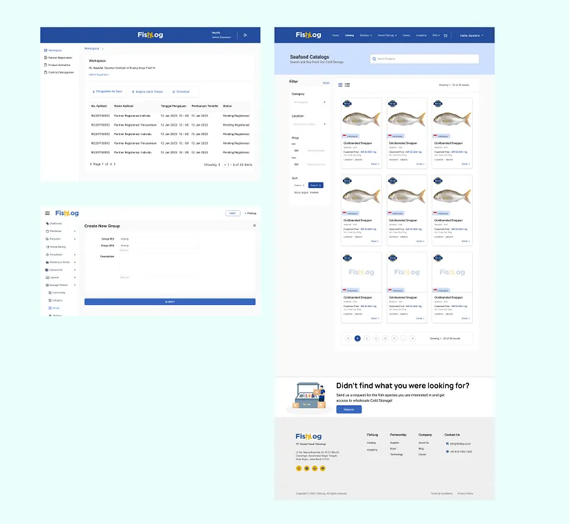
Style Guide
UI Inventory
I collected [X] components from [3] products. The inventory showed [e.g. X button variants and X text styles doing the same job].
Caption: Collecting UI components from multiple FishLog products to find duplicates and inconsistencies.
Component Audit
I reviewed each component by how often it was used, how inconsistent it was, and how reusable it could be. This decided what went into version 1: [e.g. buttons and typography first, because they appeared on every screen].Style Guide Foundation
Version 1 covered color, typography scale, buttons, spacing, component states, and basic layout references.
Caption: The first style guide defined shared visual rules across FishLog's products.
Team Alignment
Each designer had their own way of building UI, so a shared standard needed discussion and compromise. [How you resolved it: e.g. weekly review sessions and documented usage rules.]

Challenges & Improvements
A small foundation before a complete system
The system had to be built alongside ongoing product work, so I focused version 1 on the foundations every screen needed and deliberately left out [e.g. complex components like data tables and a documentation site]. A foundation the team actually used was worth more than a complete system nobody had time to adopt.
Reuse before creating
Before creating a new UI element, the team checks whether an existing component already solves the problem. [Trade-off, if true: new patterns took a little longer to introduce, but duplication dropped.]
One visual language across different products
Warehouse, finance, and marketplace products serve different users, but they needed to feel like one FishLog. [Trade-off, if true: product teams gave up some visual freedom in exchange for consistency.]
Project Outlook
This project helped FishLog establish an early design system foundation. The team gained a clearer reference for creating interfaces, reusing components, and maintaining visual consistency across products.
Although this was still an early version, it became an important step toward building a more scalable product design workflow.
Learnings
The main challenge was aligning different design preferences within the team. Each designer had their own way of creating UI, so building a shared standard required discussion, compromise, and documentation.
Another challenge was time. Since this was built alongside ongoing product work, the design system needed to be practical and realistic, not overly complex.
This project taught me that a design system is not just a UI kit. It is a shared agreement between design, product, and engineering teams.
I also learned that starting small is better than waiting for a perfect system. A useful design system should grow from real product needs, not from assumptions.
2026 ©
All rights reserved. Crafted by Mochamad Rizana Mauluddin.