
FishLog Design System Foundation
Creating the first design system foundation to improve UI consistency across FishLog’s digital
Role
UI Audit, Design System Foundation, Component Review, Visual Standardization
Industries
Fisheries, B2B Platform, Internal Product
Duration
Q3 2022 - Q1 2023
Executive Summary
FishLog had several digital products, ranging from warehouse management, finance tools, and B2B marketplace experiences. Over time, each product started to develop its own visual identity, UI patterns, and component usage.
This created inconsistency across the product ecosystem. Screens looked disconnected from one another, and the team needed a more structured foundation to keep the interface consistent, reusable, and easier to maintain.
This project became the early foundation of FishLog’s design system.
Problems & Hypothesis
As FishLog’s product ecosystem grew, the design team faced several challenges:
- UI components were not consistently used across products.
- Different products had different visual styles.
- Designers and developers often needed to recreate similar UI elements.
- There was no shared reference for colors, typography, spacing, and components.
- The product experience did not always feel connected under one FishLog identity.
The hypothesis was simple: by creating a shared UI foundation, the team could improve consistency, reduce repetitive design work, and help developers move faster with clearer design references.
My Role
In this project, I contributed by auditing existing UI elements and helping define the first version of the design system foundation.
My responsibilities included:
- Collecting existing UI components from different FishLog products.
- Reviewing inconsistencies in interface patterns.
- Organizing reusable UI elements.
- Defining the early style guide for color, typography, spacing, and components.
- Aligning with the design team on how components should be used.
- Supporting the team in creating a more consistent product experience.
Style Guide
1. UI Inventory
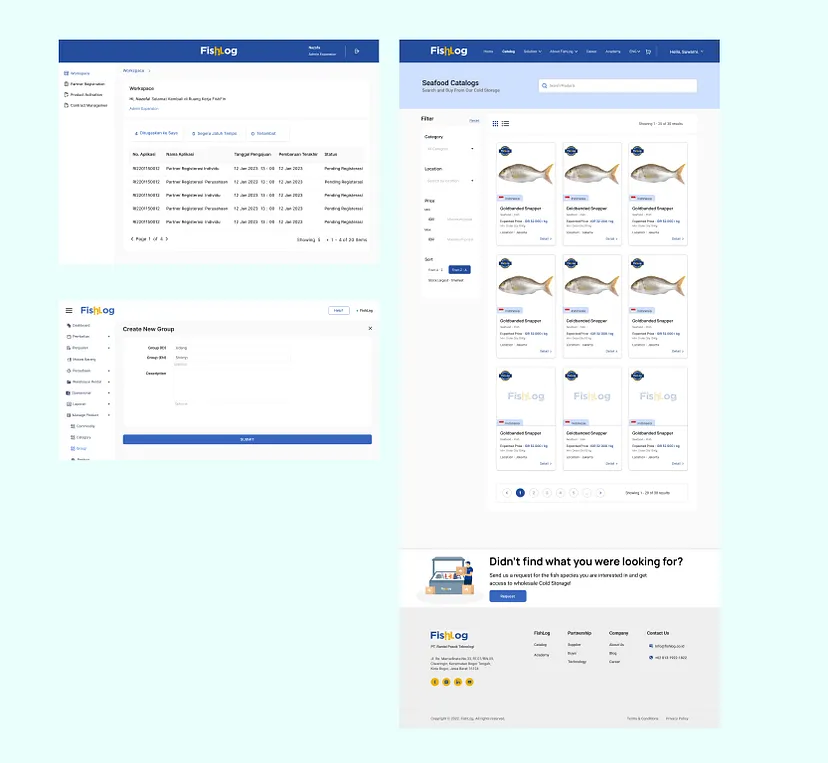
The first step was collecting existing components and interface patterns from several FishLog products. This helped us understand which components were frequently used, duplicated, or visually inconsistent.
Image caption:
Collecting and reviewing UI components from multiple FishLog products to identify reusable patterns and inconsistencies.
2. Component Audit
After gathering the UI elements, we reviewed the components based on their usage, visual consistency, and potential for reuse. This helped us decide which elements should become part of the shared foundation.
The audit helped the team see that many components served similar functions but had different appearances across products.
3. Style Guide Foundation
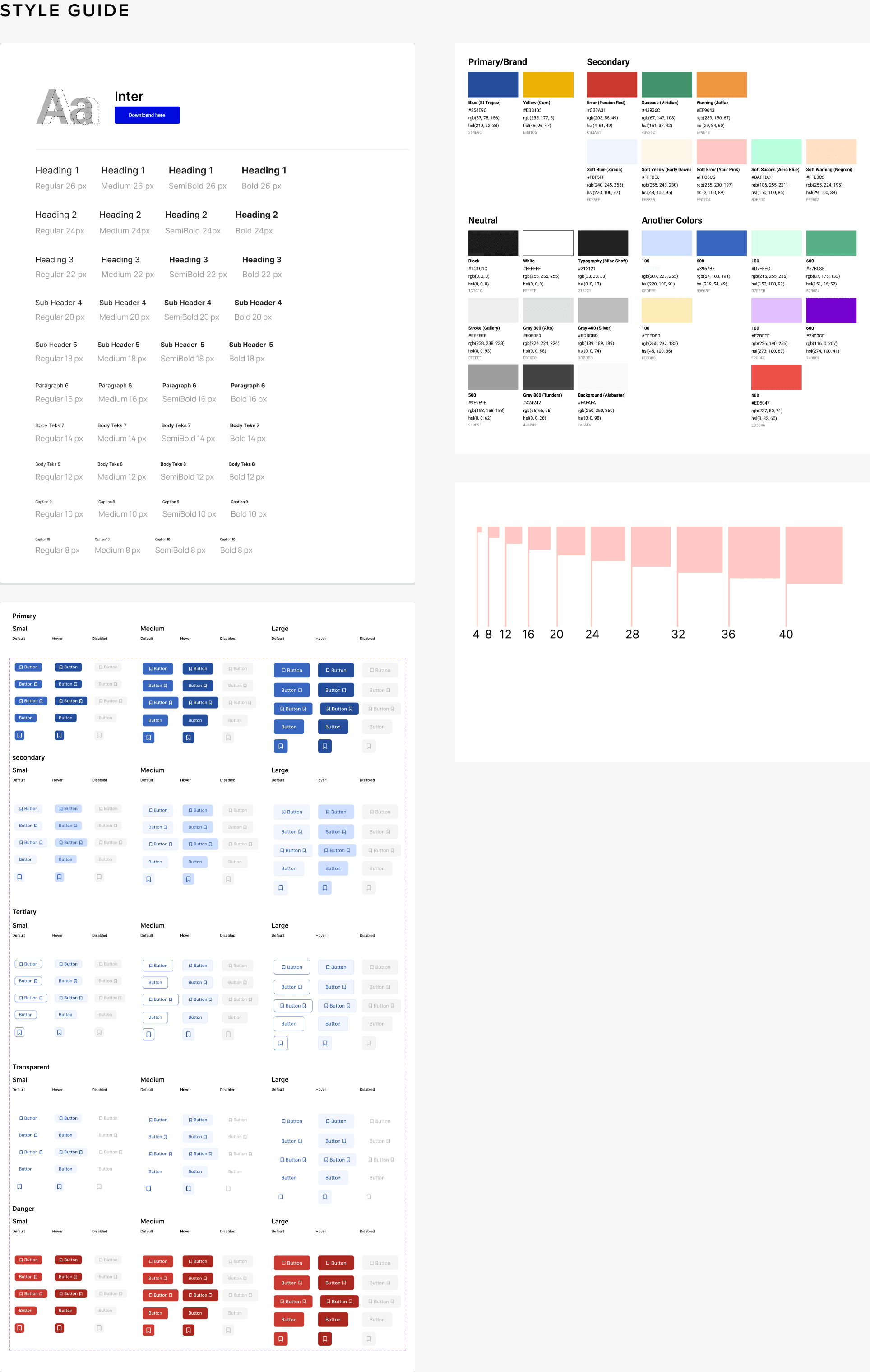
We created an early style guide that covered the basic visual foundation:
- Color palette
- Typography scale
- Button styles
- Spacing system
- Component states
- Basic layout references
Image caption:
The early style guide helped define shared visual rules for FishLog’s product interface.
4. Team Alignment
The design system was not only about creating components. It also required alignment between designers and developers. We discussed how the shared components should be used and how the system could grow over time.
Challenges & Improvements
Reusable Components First
Before creating a new UI element, the team should check whether an existing component can solve the same problem. This helps reduce duplication and keeps the product easier to maintain.
Consistent Visual Language
The design system needed to make FishLog products feel connected, even when each product served a different use case.
Simple Foundation Before Complexity
Since this was the first version of the design system, the priority was not to build a perfect system immediately. The goal was to create a practical foundation that the team could improve over time.
Project Outlook
This project helped FishLog establish an early design system foundation. The team gained a clearer reference for creating interfaces, reusing components, and maintaining visual consistency across products.
Although this was still an early version, it became an important step toward building a more scalable product design workflow.
Learnings
The main challenge was aligning different design preferences within the team. Each designer had their own way of creating UI, so building a shared standard required discussion, compromise, and documentation.
Another challenge was time. Since this was built alongside ongoing product work, the design system needed to be practical and realistic, not overly complex.
This project taught me that a design system is not just a UI kit. It is a shared agreement between design, product, and engineering teams.
I also learned that starting small is better than waiting for a perfect system. A useful design system should grow from real product needs, not from assumptions.
2026 ©
All rights reserved. Crafted by Mochamad Rizana Mauluddin.