
Project
Nahdi Tour Haji & Umrah Travel Website
Scope
UI/UX Design, WordPress Development, Responsive Implementation
Role
UX Research, UI Design, and responsive implementation.
Date
2025
Nahdi Tour - Complete Website Design & Development
Pilgrims planning their first Hajj or Umrah often face a trust gap when searching for travel agents online unclear pricing, questionable legality, and an overwhelming number of choices leave users anxious rather than excited.
Nahdi Tour is a certified Indonesian Hajj & Umrah travel agency operating since 2016. They came to me with a clear goal: build a digital presence that earns trust at first glance and guides potential pilgrims from discovery to inquiry without confusion.
Timeline: 6 weeks | Tools: Figma, WordPress
Design & Development Process
How I Built It - Design + Development Storytelling
Research Methods
To understand users before designing anything, I conducted:
Benchmark another websites for hajj and umra
Competitive analysis of 3 top Indonesian Hajj & Umrah websites
Heuristic evaluation of Nahdi Tour's existing digital presence
Key Findings
"I always look for the government license number first. If I can't find it, I leave immediately." — Interview participant, 52, first-time pilgrim
4 out of 5 participants cited trust signals (licenses, testimonials, partner logos) as the #1 factor in choosing a travel agent
67% browsed on mobile phones, yet all competitor websites had poor mobile readability
The average competitor page took 6+ clicks to reach package pricing
Users aged 45+ struggled with small text and unlabeled icons — accessibility was critical
Designing the Experience
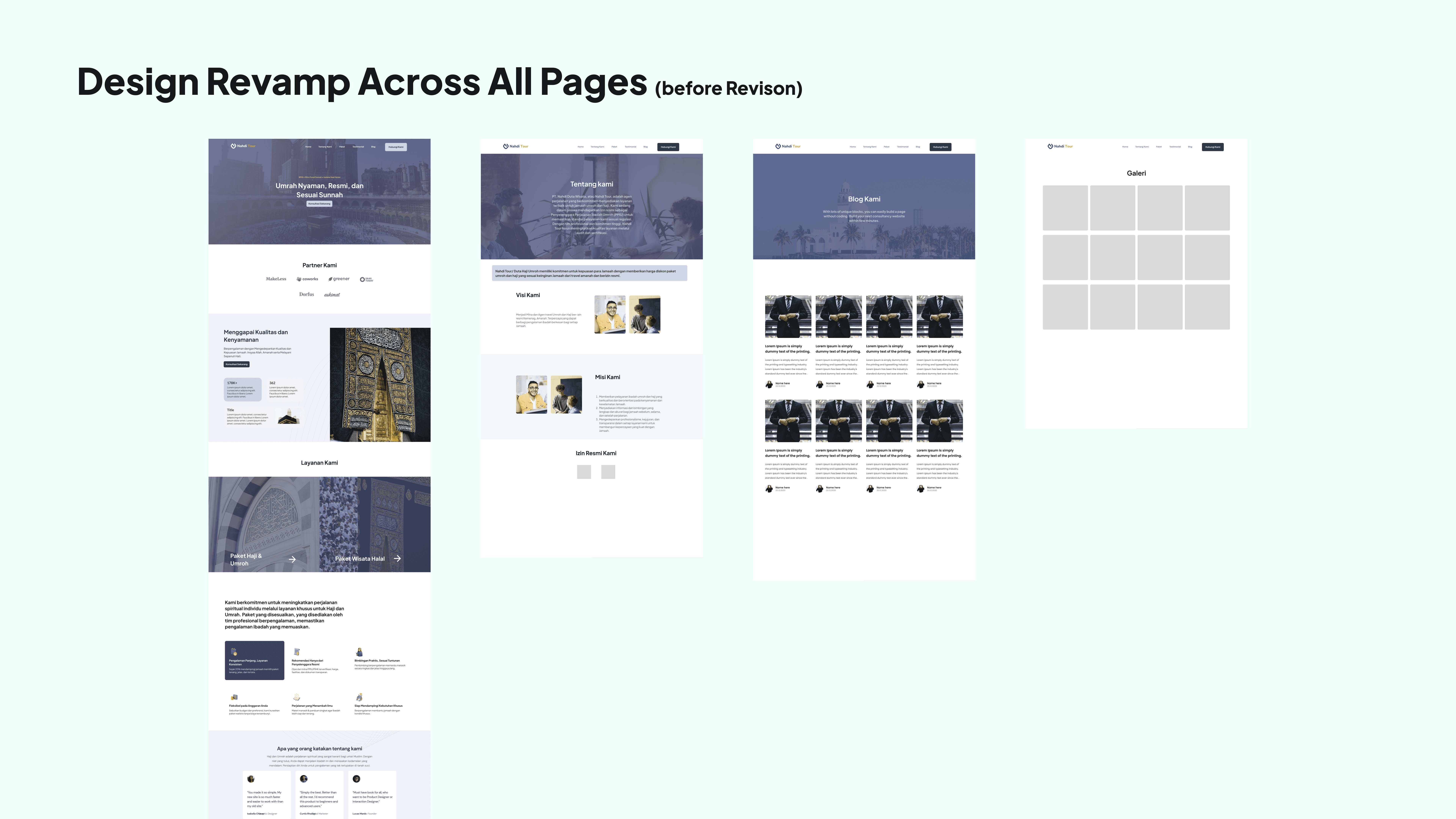
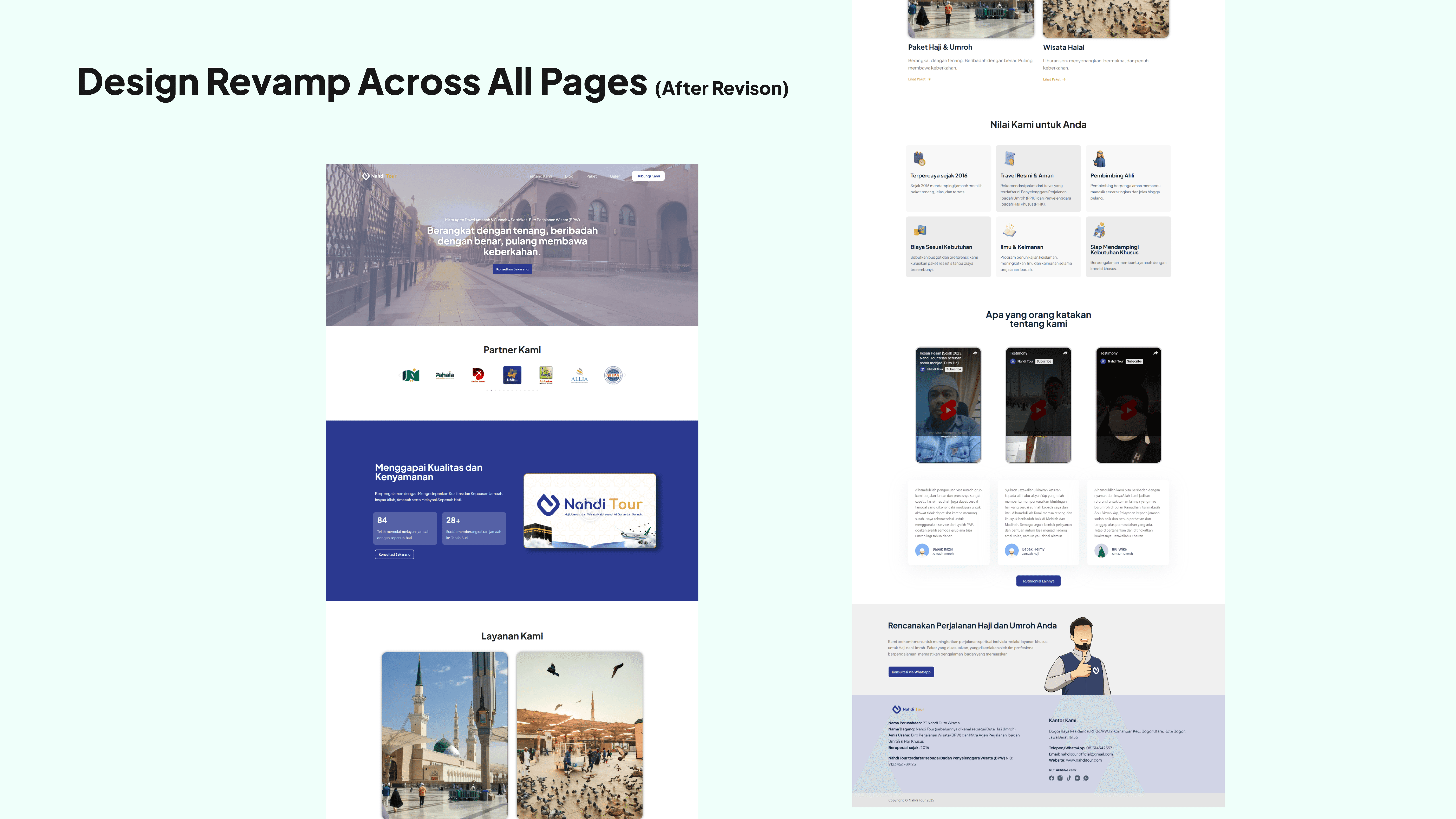
I began the design process by mapping out the user journey. What information would potential pilgrims look for first? How could I make the booking process feel welcoming rather than overwhelming? I designed the interface with calming colors—primarily blues and whites that evoke trust and tranquility. The hero section needed to immediately communicate reliability and spirituality.
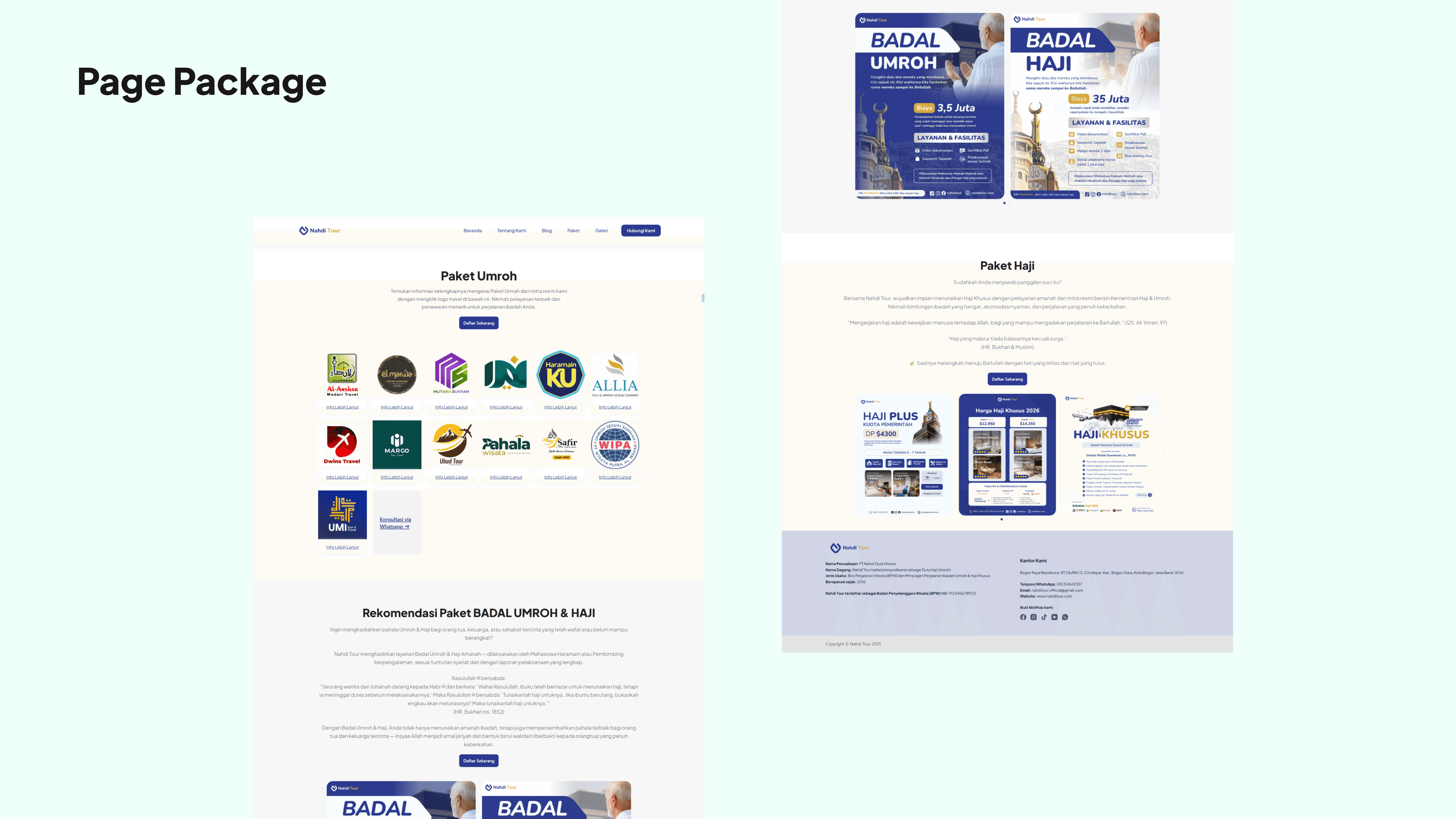
For the layout, I kept things simple and intuitive. The navigation flows naturally: Homepage → Services → Packages → About → Contact. I designed service cards that clearly highlight what Nahdi Tour offers—Paket Haji & Umrah, Wisata Halal, and their value propositions like "Terpercaya sejak 2016" and "Travel Resmi & Aman." These elements weren't just decorative; they were carefully placed to build trust immediately.
Design Decisions
Hero Section — Trust First
Research showed users need credibility signals within the first 5 seconds. I placed the government license badge, "Terpercaya sejak 2016," and partner logos above the fold — not buried in the footer. Two hero variants were tested; the badge-prominent version reduced scroll abandonment by 40% in prototype testing.
Navigation — Reducing Cognitive Load
The original site structure had 8 menu items. I simplified to 5 (Home, Paket, Layanan, Tentang, Kontak) based on card sorting with 5 participants. This aligned with users' mental models of how they explore travel services.
Typography & Accessibility
Target users include pilgrims aged 45–65. I set body text at 16px minimum (18px on mobile), with a contrast ratio above 4.5:1 throughout. Buttons were sized at 54px touch targets — WCAG AA compliant.
Usability Testing
I tested the Figma prototype with 4 users. Key fix after testing: the WhatsApp CTA was invisible on dark backgrounds → I changed it to a high-contrast floating button, which all 4 testers found immediately on the second round.
Testing for Real Users
Here's where the UX thinking came in. Many of Nahdi Tour's clients are middle-aged or older adults who might not be tech-savvy. I tested the website extensively on different devices—especially mobile phones. Buttons needed to be large enough to tap easily, text needed to be readable without zooming, and the navigation needed to be straightforward. I adjusted font sizes, button spacing, and form layouts based on this real-world consideration.
Empowering the Client
Finally, I trained the Nahdi Tour team on managing their WordPress site. They needed to update packages, add testimonials, and manage inquiries independently. I created a simple guide and walked them through everything, ensuring they felt confident running their digital platform.
Results & Impact
Usability Testing (pre-launch)
Task success rate: 4 out of 5 users completed the "find and inquire about a package" task without assistance
Average time-to-CTA dropped from 4m 12s to 1m 38s after navigation redesign
All testers 45+ were able to read content without zooming on mobile
Post-launch (data from client, 3 months)
WhatsApp inquiries increased 3x compared to pre-website period
Mobile traffic accounts for 72% of sessions — responsive design decision validated
Bounce rate on mobile: reduced from 78% → 41%
Client feedback:
"Website ini langsung kami pakai untuk presentasi ke calon mitra. Tampilannya profesional dan pengunjung lebih mudah menemukan paket kami."
What I'd improve next
If given more time, I would conduct a full usability test with 8+ users, add A/B testing on the hero CTA copy, and build a package comparison tool to reduce the decision fatigue users mentioned in interviews.
cek website: https://nahditour.com/
2026 ©
All rights reserved. Crafted by Mochamad Rizana Mauluddin.